
Two years ago, I posted in this blog about an evidence and gap map on science, technology, innovation, and partnerships (STIP) that I produced with colleagues from the International Initiative for Impact Evaluation (3ie). We found that a majority of the existing STIP impact evaluations at that time looked at interventions in technology, which we defined to include 11 categories of digital and data interventions. My FHI 360 colleague, Hannah Skelly, and I decided to update the evidence map focusing on just these technology categories, particularly with a view to informing our company’s strategy for digital solutions. We recently published this new ICT4D evidence map and our analysis of it in the journal Information Technologies & International Development. In this post, I summarize some of the findings by the numbers and expand on what the map tells us about the gaps in evidence.
Methods
An evidence map, or evidence and gap map, is simply a matrix with intervention categories as rows and outcome categories as columns, where the number in each cell represents the number of studies that report an effect size for an intervention in that row category on an outcome in that column category. For example, the number 1 in the top left cell in the map in the next section means that, at the time we ran the search, there was just one study that reports an estimated effect size of a digital infrastructure intervention on an outcome related to education or academe. In the case of this ICT4D map and the STIP map, the studies are impact evaluations – evaluations that measure the net effect of an intervention against an experimental or statistical counterfactual.
To populate the map with as many studies as possible, we conducted a systematic search and screening process similar to a systematic review. You can read more about systematic search and screening processes in the STIP post and also here. We built on the earlier map by rescreening the 220 technology studies found through mid-2016 for the STIP map and then conducting a new search restricted to 2015 through August 2017. Even limiting the search to a roughly three-year period, we still started with almost 30,000 hits!
After screening down to the final set of studies meeting the inclusion criteria, which included that the impact evaluations were conducted in low- or middle-income countries, we coded a small number of variables about the studies in addition to intervention categories and outcomes categories. These include: empirical identification strategy, whether the intervention was a pilot or a program, whether the intervention or study had an equity focus, whether the study reported sex-disaggregated effect sizes, and whether the study reported any cost information. The outcome category distinctions for the STIP map and the ICT4D map are a bit different than commonly seen in evidence and gap maps, as they focus on the sector in which the outcome is measured (e.g., health, education, agriculture, energy) rather than on a type of outcome (e.g., employment, test scores, perceptions or beliefs, individual behavior).
The map
The figure below is the evidence map. The cells include the exact number but are also shaded to make the main findings about the size and scope of the evidence base easier to see.
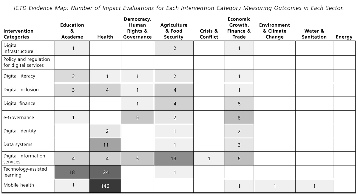
(Table 6 from Brown, AN and Skelly, HJ. How much evidence is there really? Mapping the evidence base for ICT4D interventions. Information Technologies and International Development, Vol. 15, 2019.)
By the numbers
In the article, we present our analysis of the data in the map. For this post, I thought I’d provide a few by-the-numbers findings. By “studies” below, I mean ICT4D impact evaluations.
| 253 | The number of studies represented in the map |
| 49 | The number of different countries with impact evaluations in the map |
| 27 | The most studies in any one country (China) |
| 6 | The number of studies conducted in crisis- or conflict-affected countries (as designated in the year of publication) |
| 6 | The number of studies published in 2006 |
| 73 | The number of studies published in 2016 |
| 198 | The number of studies that are randomized controlled trials |
| 202 | The number of studies that estimate the effect of a pilot intervention instead of a program |
| 32 | The number of studies that estimate effects across more than one intervention category (can be a combined intervention) |
| 7 | The number of studies that estimate effects across more than one sector |
| 47 | The number of studies that report cost information (necessary for cost-effectiveness analysis) |
| 147 | The number of studies of a mobile health intervention |
| 4 | The number of studies of a digital infrastructure intervention |
What’s missing?
The 3ie standard evidence and gap map format was designed to highlight the gaps in evidence, because this information is important for appropriately allocating funds for new impact evaluations. In my work with Hannah, we called the map just an evidence map because our first priority was to help our colleagues and others find the evidence that already exists. The supplementary materials for the article, give the list of studies with hyperlinks to the sources by cell.
A second gap is in the environment and climate change sector, where there is also only one impact evaluation. Chong et al. (2015) [gated] test whether pro-recycling messages sent via SMS in Peru can influence recycling behavior. They find that these messages don’t make a difference. There is also only one study that measures a water and sanitation outcome. Dammert et al. (2014) [gated] test a pilot intervention to deliver health information about dengue to households in Peru and find a reduction in the number of containers in treatment households that test positive for dengue larvae. The final sector gap is for energy, for which there is no impact evaluation measuring the effect of an ICT4D intervention.
Our search started in September 2017 and we did find a dramatic yearly increase in the number of new ICT4D impact evaluations, so there are probably a few more studies for these four sectors now than reflected in the map. Nonetheless, one can imagine many potential ICT solutions for these sectors in low- and middle-income countries, especially when looking beyond simple SMS applications to interventions using data systems, digital identity, technology-assisted learning, and others. To know what really works in ICT4D in these sectors, we need more impact evaluations.
The good news is that there is a lot of evidence for some of the intervention categories across the other sectors – 146 studies of mHealth interventions on health outcomes! In a future post, I’ll talk more about how to read and use an evidence map.
P.S. Make sure to check out Hannah’s great post about three women leading the charge in ICT4D research!
Photo credit: © 2017 Arturo Sanabria, Courtesy of Photoshare